A good website is a combination of numerous vital elements incorporating design, content, navigation and functionality. Nowadays developing and maintaining a website is one of the most important facades for any company and therefore has to be creative and innovative yet simple and user-friendly, not overly complex and engaging. Keeping the website user-friendly will improve its performance to a great extent, entice more views and boost sales for the business.
Being a part of the fast-evolving digital era, we are all aware that creating a professional website is no longer an issue which needs to be ignored. The real question is how to make our websites popular and user-friendly? What are the basic principles to follow?
A well-built website and improved user interface will result in increased traffic on the website. Creativity is important, but there are some basic rules about design and user experience which will help in growing your business by attracting more users. When creating or redesigning any website, keep the following basic principles in mind.
1. Less Content and More Readability
Content is the most important factor convincing users to stick to any website. Providing content that is unique, easy to read and understand, is the stepping stone in making a website user-friendly.
✓ Make content easy to scan- Mostly user simply have a glimpse of the content instead of going through all. Keep short paragraphs. Formatting text in columns similar to the newspaper style is a good way to make the text easier to scan. Proper use of headings, sub-headings, paragraphs, bullets point will help to break up text, making it easy for viewers to go through the main parts of the page and quickly discover what they need.
✓ Use of right color schemes- Maintaining the right balance between the contrast of the background of the website and the content is one of the basic, yet most significant things to do. Lack of contrast makes the content difficult to read. Make sure that to select the best color scheme so content stays highly visible.
✓ White space- White space is important when highlighting elements and making them prominent needs to be done. It also helps in keeping users mind s focused on the essential elements. According to the latest Web design trends, leaving an adequate amount of white spots is not wasteful but vital to make a design look clean and less cluttered.
✓ Readable font- Keep in mind that San serif fonts are commonly accepted and work best for online design whereas serif fonts are appropriate for the print design. Also, avoid using too many fonts as it makes the content hard to scan. Always highlight or make bold the headings, keywords and links to make them stand out.

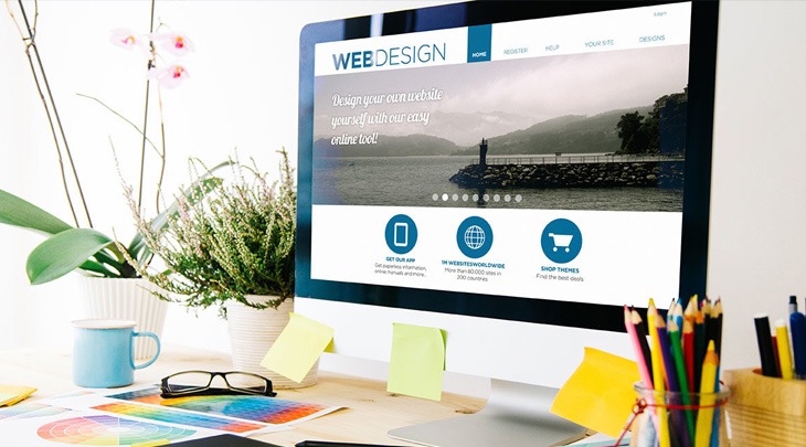
Example 1: How beautifully the correct use of the color combination, font and white space has been used.
2. Work on Navigation
Make the navigation simple and clear. Having a clear navigation is the best to make your website friendly to the visitors. Try to have less number of menu items as far as possible. Make navigation equally on each page, will help in facilitating browsing the site faster.
✓ Highlight menus – Confusing and complex layouts are one of the main reasons why a website loses its customers. Highlight menus like “Home” or “Latest Deals” etc. to make them more visible to the users.
✓ Place it tactfully – To makes visitors easily locate the menus and navigate through the site easily, the best place to locate the navigation bar is at the top or left-hand side of the website. Make sure that navigation needs to be above the fold, irrespective of the various devices used.

Example 2. In this example, menus are placed at the top for simple and easy to use navigation
✓ Use of Sitemaps – Sitemap is of great importance not only in terms of search engines but also for helping visitors in finding specific pages. It can b created both in XML and HTML format.

Example 3. Sitemap in XML format
✓ Search bar is a must – Adding search functionality to the website is a smart way to help users in finding out the information they are looking for. It will help not only to cope with search queries and track the searches on the web site, but also get an insight into of what visitors are interested into.

Example 4. Use of Search Bar
✓ Simple Menu names – Avoid using complex navigation titles in the menu unless their meaning is clear to understand. Otherwise, visitors will get confused on where to navigate. Using common names like “Home, New offers, About us, Contact us, Blog, Services, Store locator” etc., facilitate users to navigate effortlessly through the content of each page.
3. Focus on increasing the speed of the Site
Give preference to the functionality of load time. Visitors will get impatient if the site is taking too much time to load. Ignoring the load time in any web design will result attract fewer visitors. This is the most critical element of a user-friendly site. Make sure that website loads within 4 to 6 seconds. Proper speed is an important feature of site usability and also one of the foremost reasons why visitors would stop sticking around the site. It also affects search engine rankings. Google bots look at the page speed, so work on it and try to speed it up!
✓ Avoid using large videos and photos – Adding multimedia to web pages will make it look more enticing, but the usage of large photos and videos will make the pages become heavy and slow to load.

Example 5: Use of small size Images
✓ Compress images/video to reduce load time – In order to speed up the website, the best thing is to compress images using the suitable file type. Resize images before uploading them using tools like Adobe Photoshop, Fireworks etc.
✓ Keep an appropriate number of redirects – There is a risk that with the time some pages become outdated or updated with new versions. As a result, some external links keep pointing to the old web pages. To avoid spoiling user experience, we often use internal redirects. However, having too many of them can radically slow down the webpage speed. To minimize redirects issue make sure that the internal linking is properly working.
Sticking to above-mentioned principles will ensure that your site stays user-friendly and functional. Websites can be powerful tools for the growth of your business. Any broken links on the website will be a question of your credibility and aggravate the visitor. If possible, try to test every single link, button, page, and form before the final launch of your website. If you want to achieve great results and deliver exceptional performance with your website, the best you can do – keep validating its usability on regular intervals; keep enhancing its content by adding unique and exciting data for users and keep surpassing your users’ expectations!
Hope you liked my effort! Please leave your suggestions and feedbacks in comments.